
My Health Portal
My Health Portal is designed to simplify communicating between physicians and patients in exchanging information seamlessly. This platform is to help improve the overall quality of care and allow patients to have access to personal medical records and use various self-service features. This was a design challenge to improve the visual interface and the overall user experience that can be adapted for the web and mobile application. This digital service is intended for the user to have clear and trustworthy experience in knowing and controlling their health information.
Role UX/UI Designer
Field Digital,Design Research


User Research
I asked users questions if they have or use a health portal to connect with their doctors other than during a physical encounter during an appointment. What other reasons they use their portal and how they receive their personal medical information.
I presented this image of a wellness result to users without explaining the meaning of the content. After allowing them to look at the image I asked: What they understand from the image shown. What hierarchy does the visual data inform them?
PROBLEMS
1. I asked users what are the reasons why they use their existing health portal and how do they connect with their physicians about questions or setting up an appointment. When trying to book an appointment through the portal the user is brought to the main website to complete the task and making them log back into their portal system.
2. Patients who don’t receive verbal communication through a phone call or email about their medical results after their appointment, but have access to view it through the app can’t understand or read the data that the is being displayed.
USER PERSONA
From the data, I gather I created a user persona that would help me achieve the right style and design for the app. The persona is based on users that visit the site who have physicians through the same Medical Group and can share her medical history through one system.

“Picking a foot or primary care doctor before setting up an appointment, I would want to a small bio about themselves and as well as their specialties”
NAME: Amanda
Age: 29
Location: New York, NY
Doesn’t always have time research new doctors through another web browser. Also, have to search for their doctor through a list of other doctors and that might not available under her insurance. Or after a normal check might forget to call or not been contacted by a doctor about your medical results.
WANT & NEED
Sometimes she is too busy or unable to reach her physician during office hours, but instead of having to call the doctor’s office and leaving a message or having to call repeatedly. Would like to have access to her medical records during any time and being able to contact her physician for a prescription refill or being able to ask for advice before making an appointment.
ANALYZING RESULTS
Booking and knowing about Upcoming Appointments: I have to call my doctor’s office to book or go through a different online platform to book an appointment. A front desk receptionist normally calls 24hrs in advance to inform me about an upcoming appointment.
Reason for seeing a physician: To see my primary physician to have my annual physical. Normally I have to my doctor call me or not hearing anything at all about my lab results after attending my appointment.

DESIGN GOALS
To simplify and easy access to information
To minimize the number of inputs in achieving a task
To create empathy and impacting user’s needs
-
USER FLOW

-
WIREFRAMES
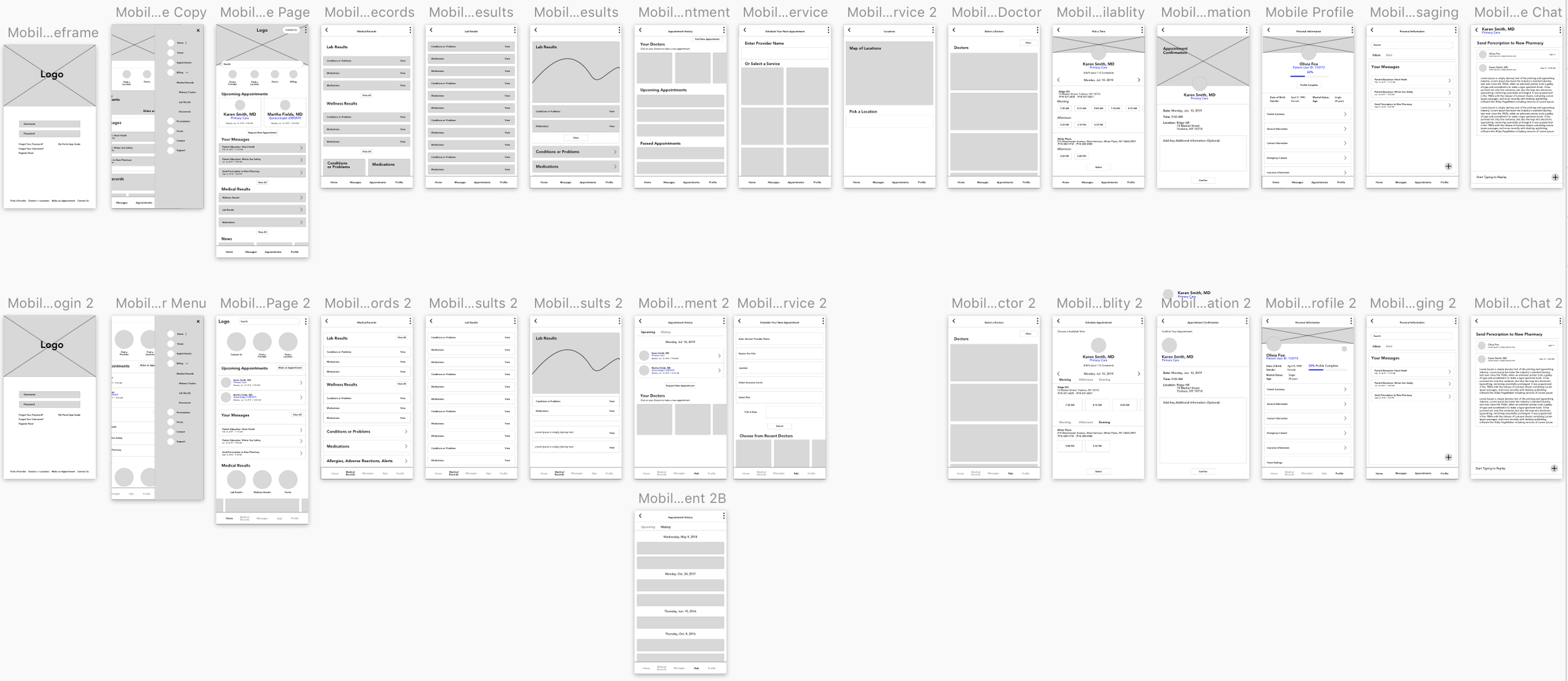
A/B TESTING
During my design process, I did A/B Testing for the pages to see what would be most effective for reading and understanding your medical results. Also gaining insight on what the user prefers on the amount of information and steps of scheduling their next appointment.
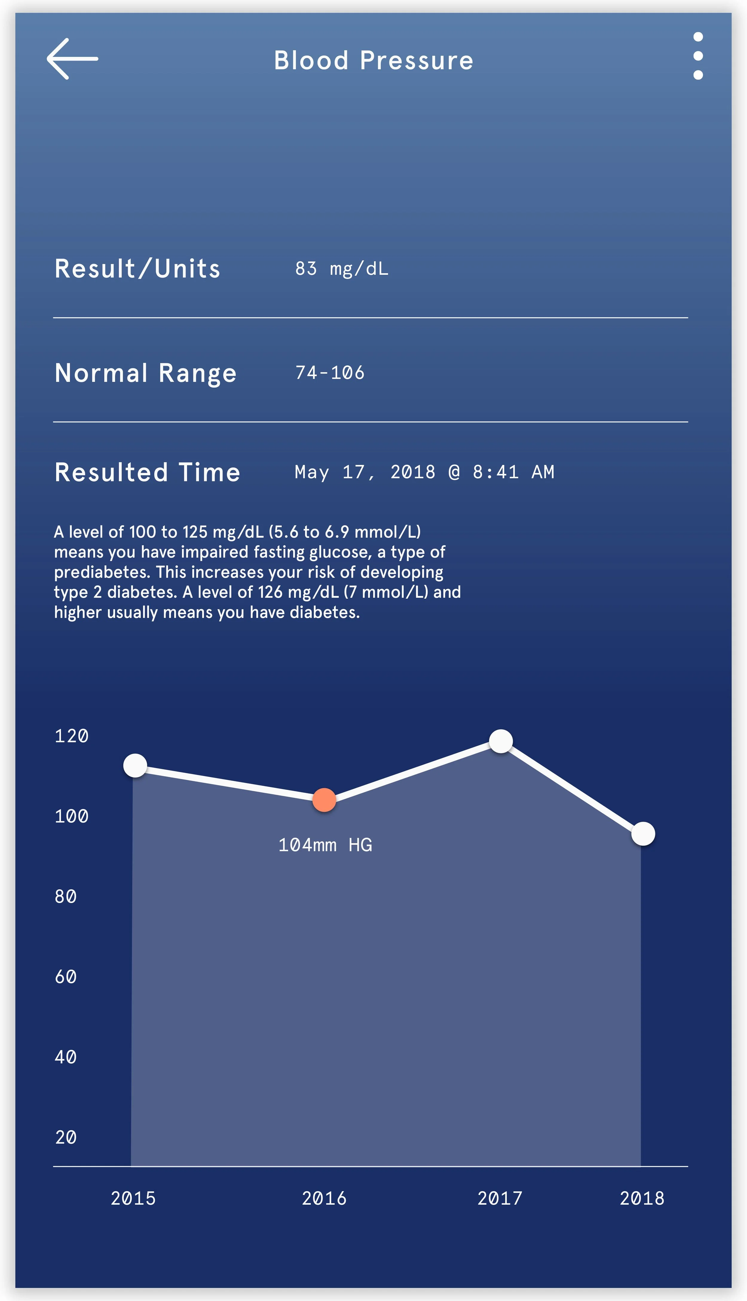
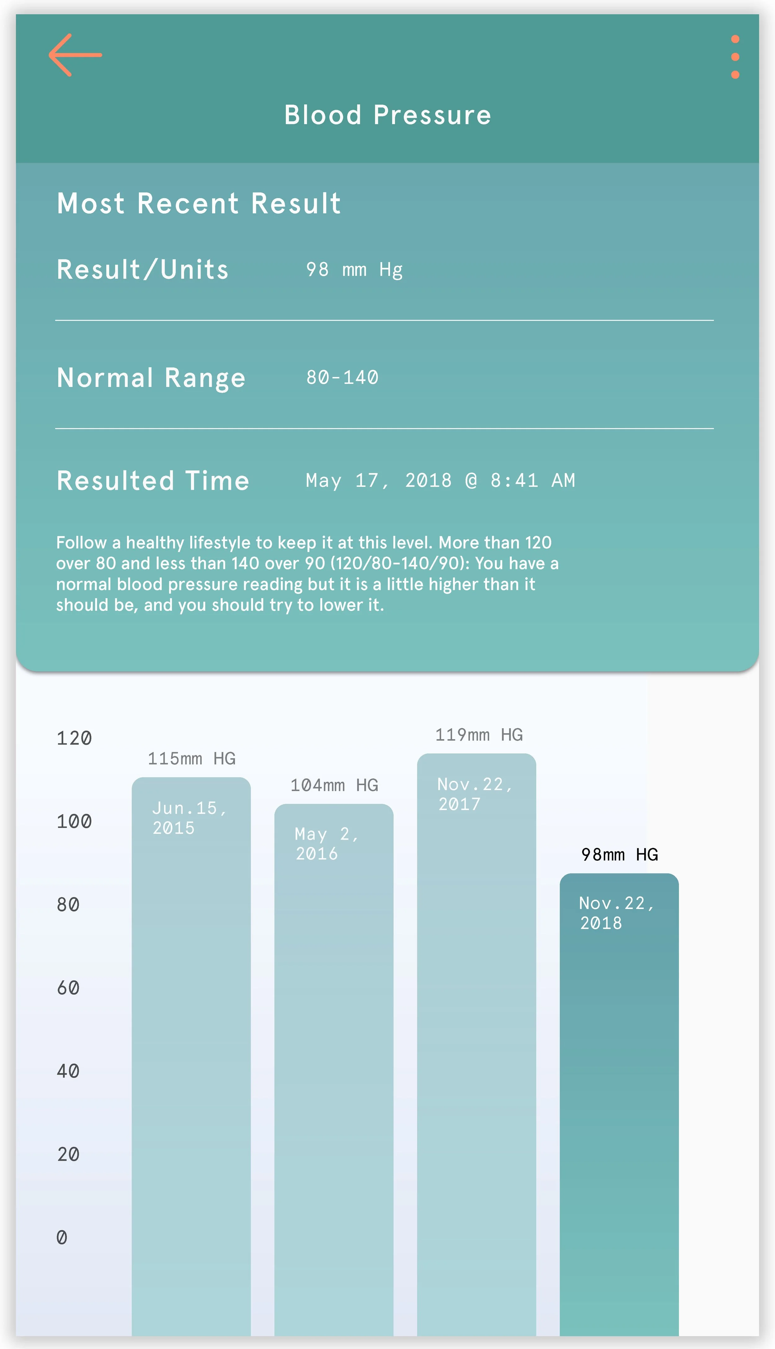


VIEWING YOUR MEDICAL RESULTS
The solution to designing a successful user experience is to provide enough content that the user would be able to read and understand in supporting the data visualizations of information. Designing a few different versions of the graph to help represent the data in a minimal, but convey enough explanation without it being to compact with additional information. Creating a bar graph that indicates the most current result and providing colors to indicate a metric to help lead the eye in understanding the range of the reading level.


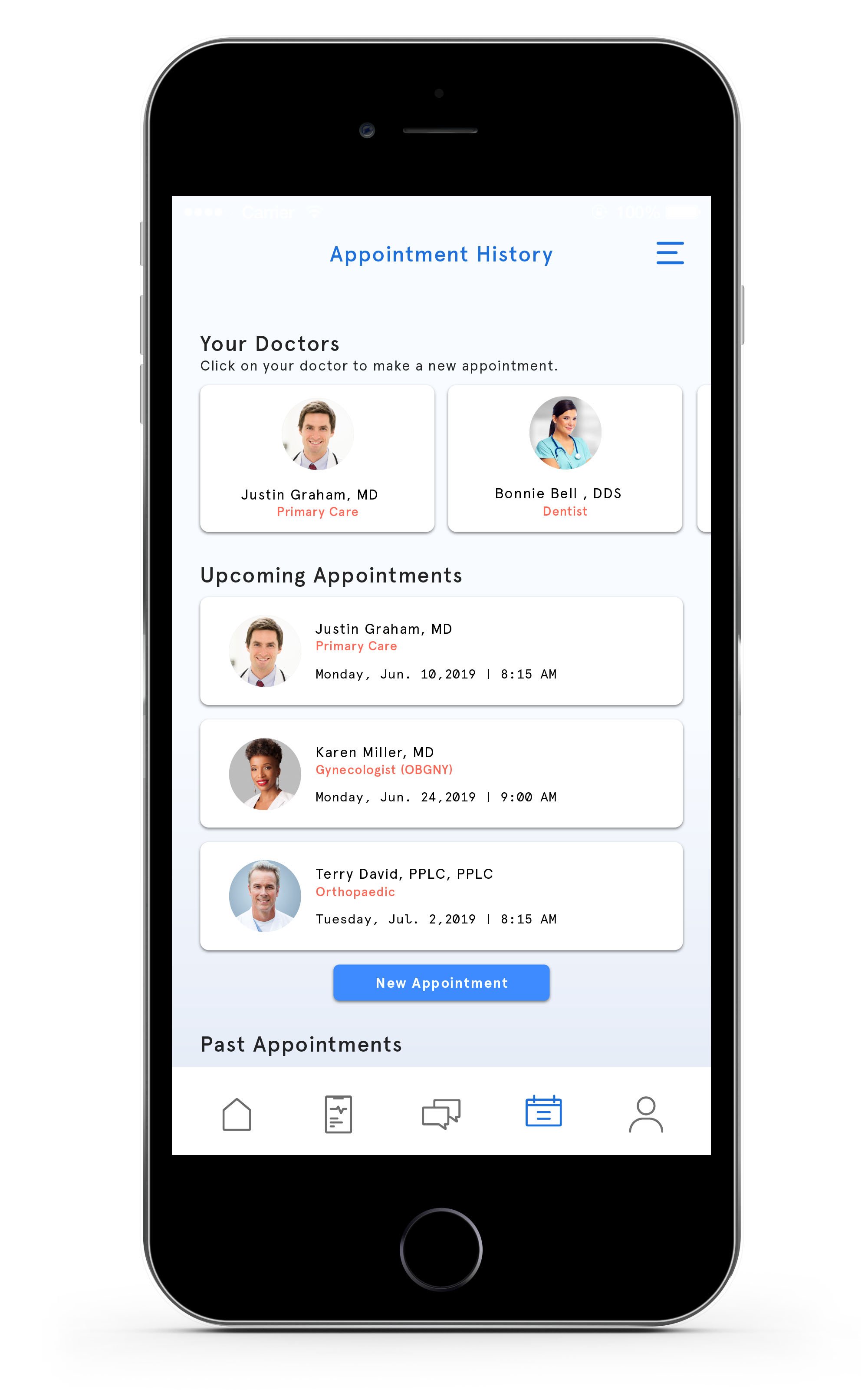
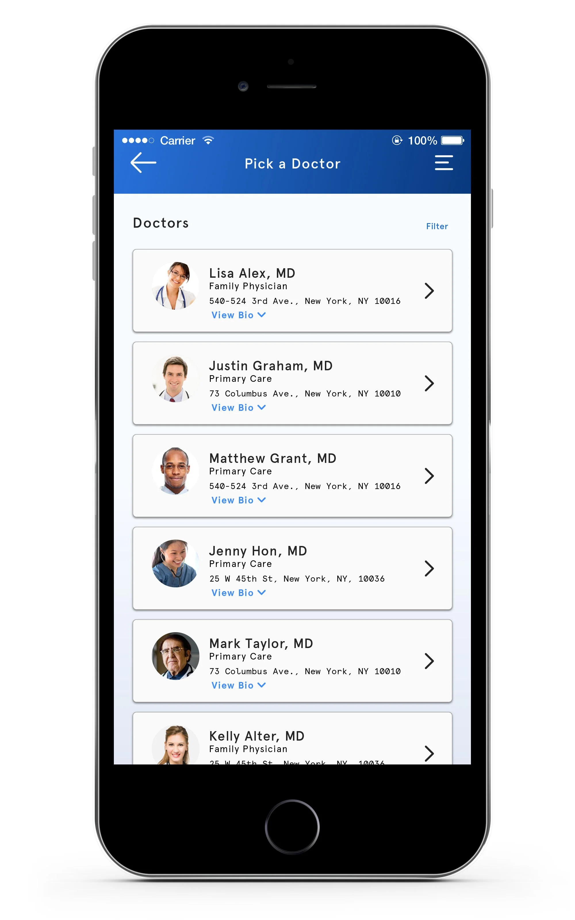
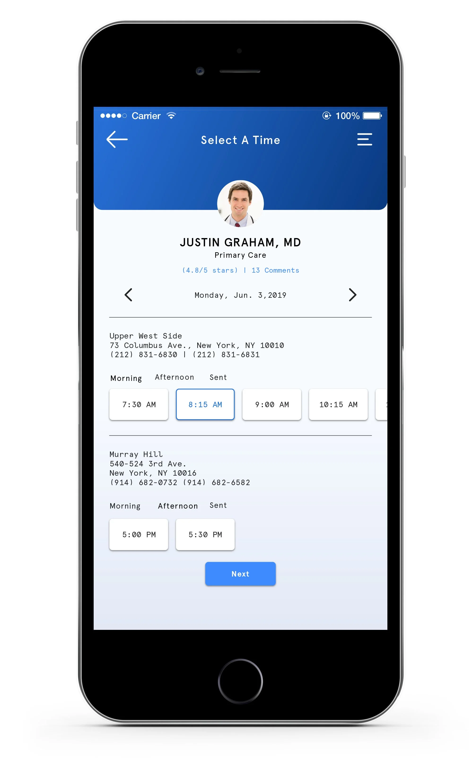
SCHEDULING A NEW APPOINTMENT
Users can keep track of upcoming on the home page and the appointment page. Creating a simple step by step experience of scheduling their next appointment users would have the ability to view their current physicians on top of the main Appointment History page as a feature, then having to go through a new appointment search.
When creating a new appointment is a simple experience, allowing the user to search based on what information they enter to increase their results. Using scale and color to help differentiate and establish a hierarchy within each page. The user is informed which section of scheduling their next appointment.


Protoype
I designed the experience to have a simple flow, that the user can click step by step in understanding the data results. To allow them to view their resent result and then expand to a larger graph that represents time relating to all past tests. The line graph is also designed so they can tap onto each main point to read the differentiation of each year. By emphasizing what the user can focus on since their test results might not have a drastic change over time. Sharing this prototype with a user to collect future data of how they can register and information to continue creating responsive designs to other future platforms.